Travel Tech · Marketplace · B2B2C · White Label
Building a global travel & experiences platform.
Designing a multi-category marketplace for flights, stays, attractions, sports, and experiences — delivered as a white-label platform across global B2B2C partners.
This was less about a single app and more about a system: one product foundation that many brands, partners, and loyalty programs could shape into their own travel and experience marketplace.
Marketplace
Multi-category travel & experiences
White Label
Configurable per partner brand
B2B2C
Partners, merchants, and end users
Global
Multi-region, multi-currency, multi-language
Starting Point
Starting from a real product.
This project didn't begin with a blank canvas. A live platform already existed — with enterprise clients, real users, and real revenue.
The job wasn't to invent a new product. It was to evolve an existing one into a scalable global experience, which meant understanding the business limitations before making a single design decision.
The challenge was evolution, not reinvention.
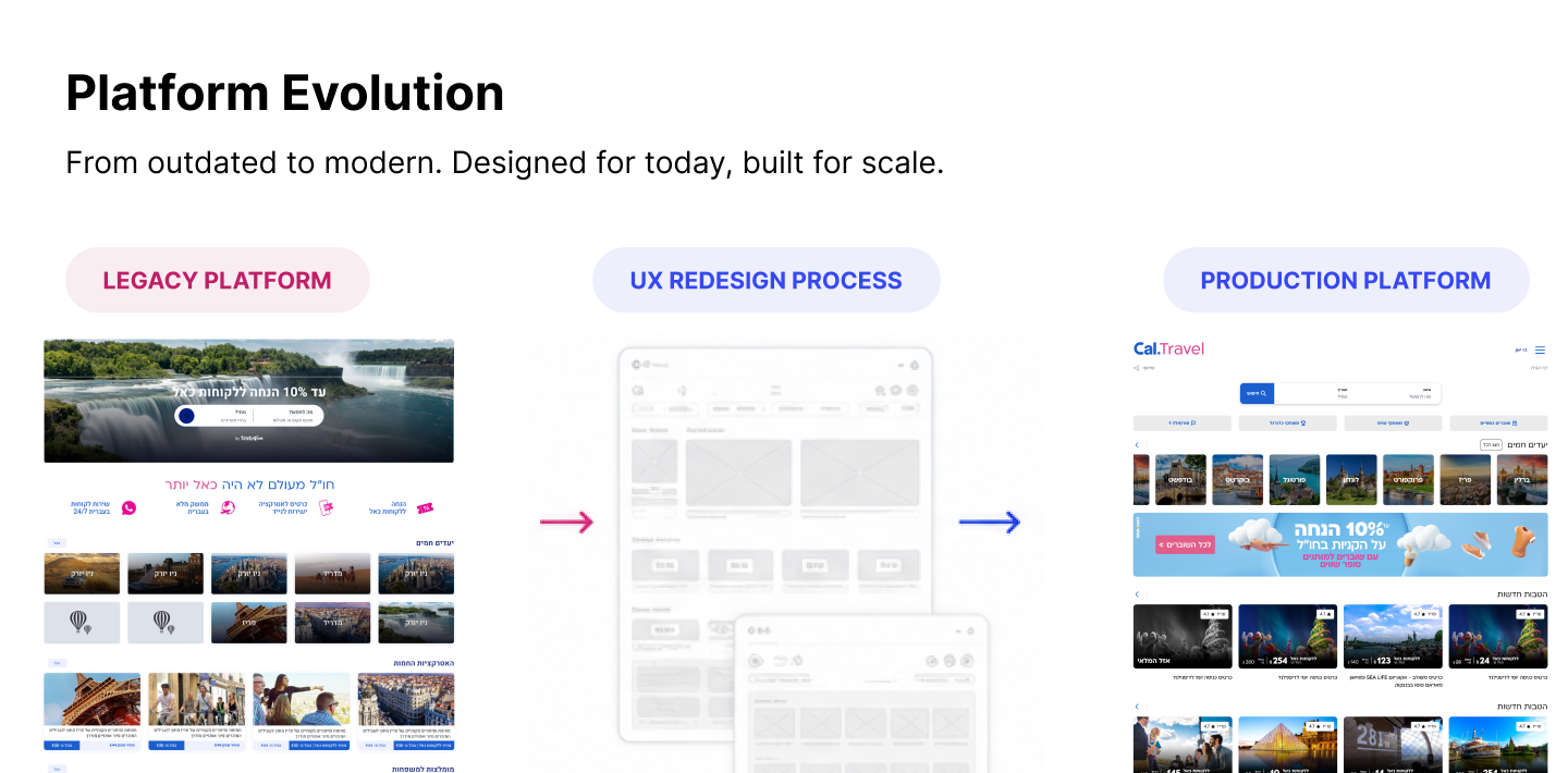
Platform Evolution
Designed for today, built for scale.
From a legacy experience, through redesign, into a modern platform built to scale across brands.
The Approach
Why evolution beat starting over.
Rebuilding from scratch would have broken what already worked. The existing product had to keep serving real customers every day while becoming dramatically easier to scale.
So the goal was never prettier screens — it was a stronger, more scalable foundation delivered without disrupting the business already running on it.
Improve the engine while the car keeps driving.
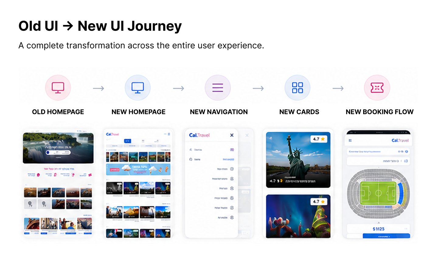
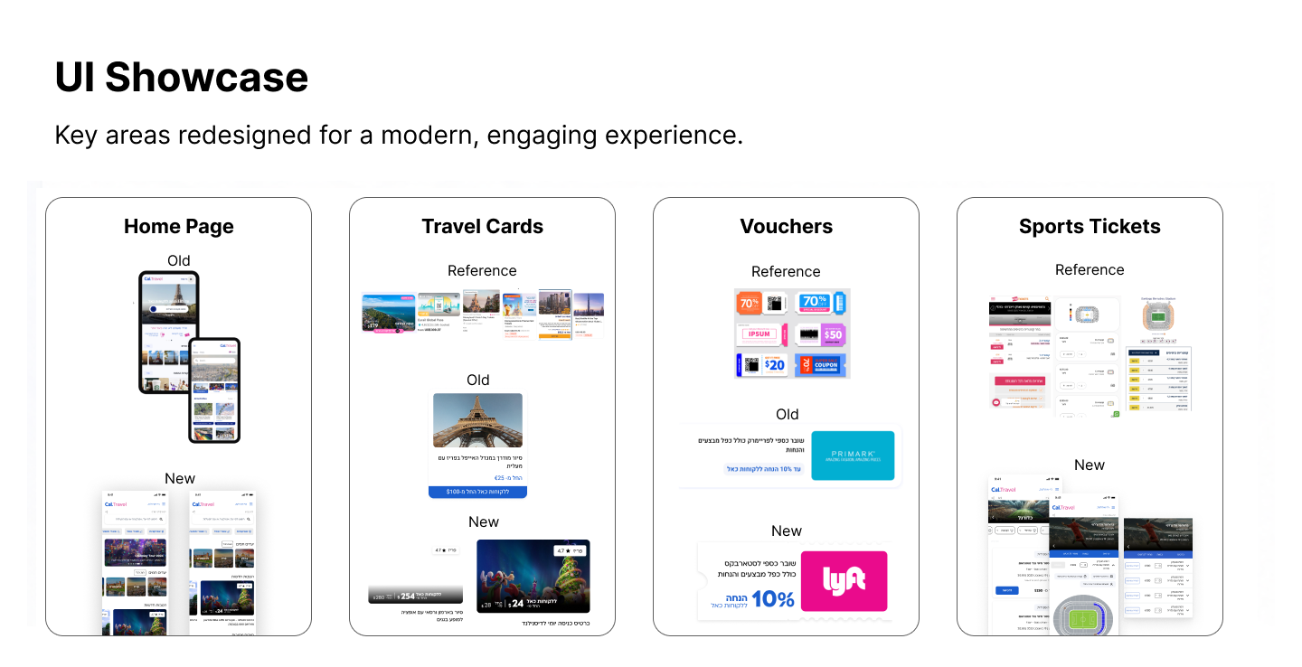
Old UI → New UI
A transformation across the whole journey.
Every step evolved — homepage, navigation, cards, and booking — without abandoning the platform underneath.
My Role
Leading product design end to end.
I owned the experience and the design system that made white-label configuration possible — working across product, engineering, suppliers, and partners.
- Product & UX strategy
- Marketplace & discovery flows
- White-label design system & theming
- Multi-category booking & checkout
- Loyalty & rewards integration
- Global, multi-region experience design
Design Constraints
The constraints that shaped everything.
Real business limits — not aesthetics — defined the design space.
One platform had to serve many businesses at once.
Every client expected an experience that felt native to their brand.
There was no capacity to build and maintain a product per client.
The only viable path was one scalable UX system serving every brand.
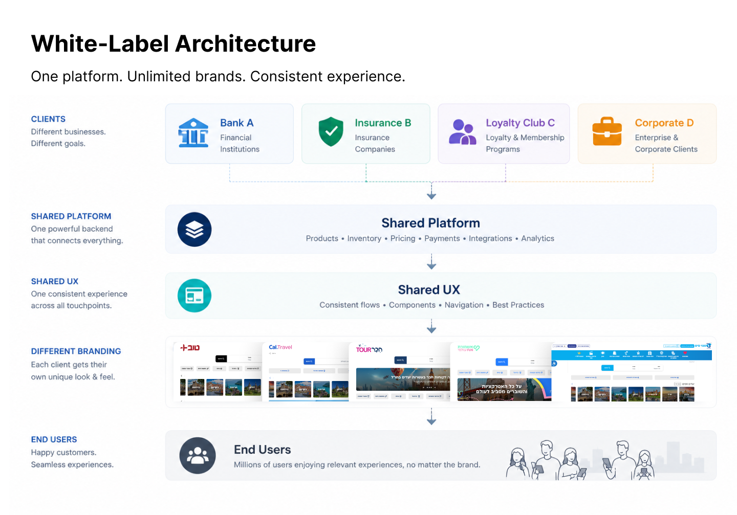
White-Label Architecture
One system, unlimited brands.
The challenge became a single, scalable UX system that felt native to each brand while sharing the same underlying architecture — different branding, promotions, and goals, one product foundation.
Platform Complexity
Designing one experience for an entire ecosystem.
This wasn't a typical travel booking website.
Every design decision had to work across multiple stakeholders simultaneously—travelers, loyalty clubs, enterprise partners, suppliers, payment systems and operations.
The challenge wasn't designing individual screens. It was creating one scalable UX system that could support hundreds of client brands, thousands of travel products and multiple business models while remaining intuitive for end users.
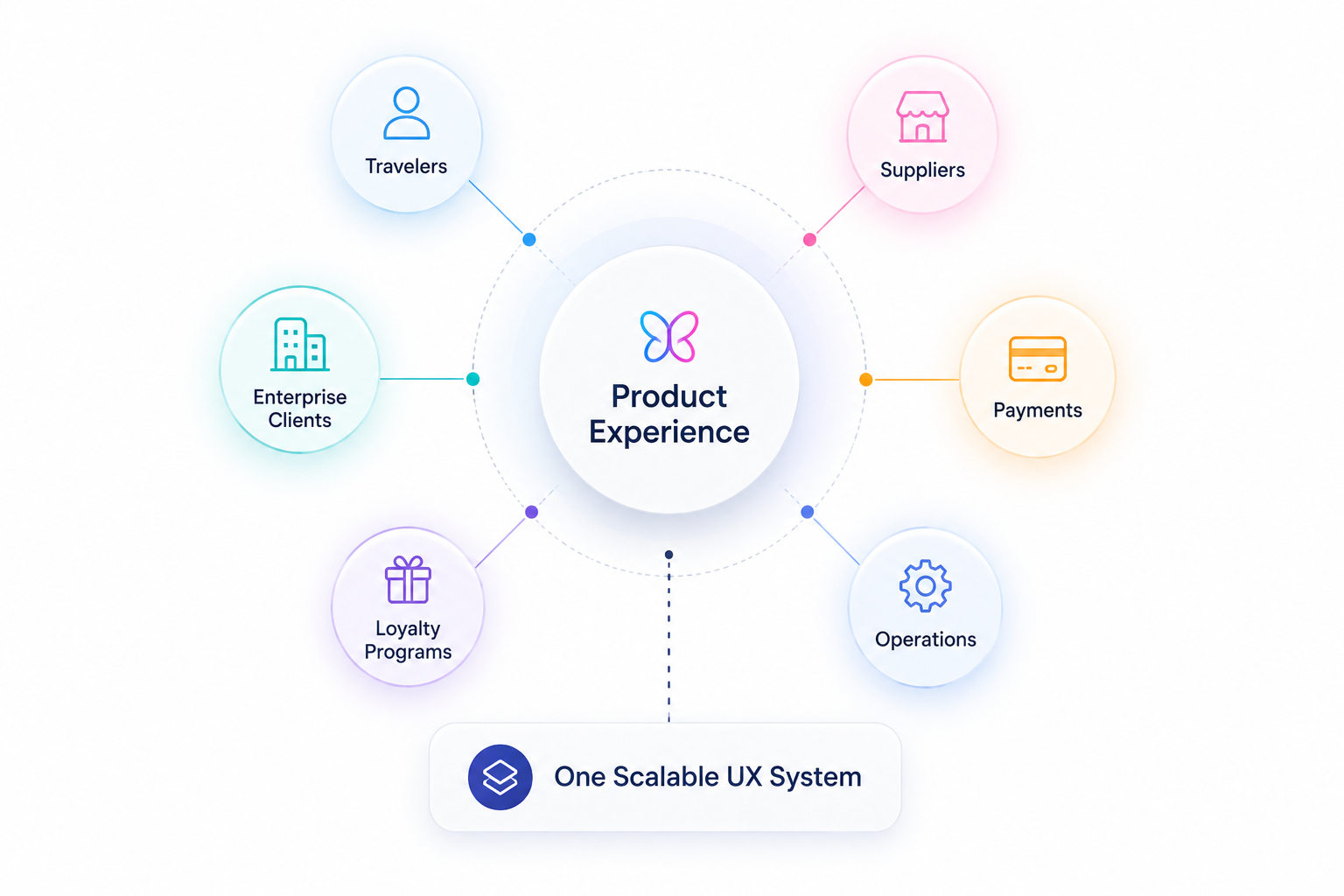
One Product. Six Stakeholders. One Consistent Experience.
Systems Thinking
Connecting complexity into one experience.
Attractions, sports, gift cards, and transportation each carry their own rules — wired into one experience travelers never had to think about.
“A white-label platform succeeds when every partner feels it was built only for them.”
Research
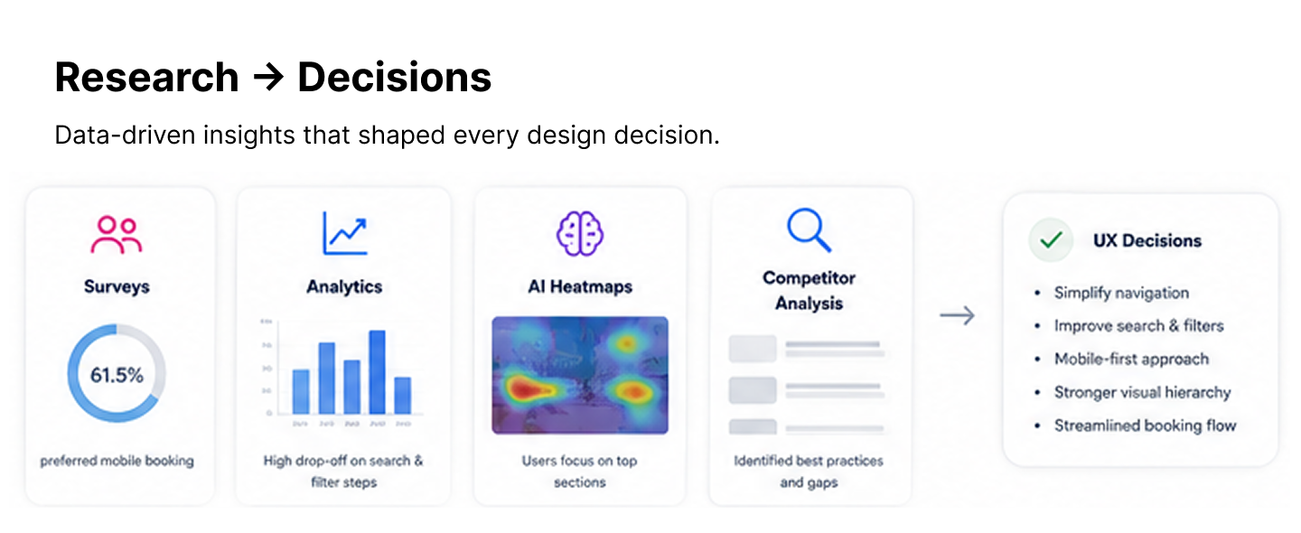
Research that shaped the decisions.
Decisions were grounded in real signals, not instinct:
• 1,782 survey responses • Google Analytics • Hotjar • AI-assisted behavioural analysis
The methods mattered less than what they changed. Drop-off clustered around search and filtering, so discovery was simplified. Attention concentrated at the top of the page, so hierarchy was sharpened. Mobile drove real decisions, so complex flows were built mobile-first.
Research → Decisions
From insight to design decision.
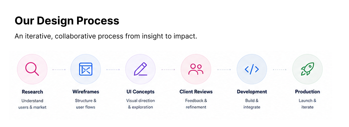
Design Process
An iterative, collaborative process.
From research and wireframes to UI concepts, client reviews, and production — every stage was validated with partners before it scaled.
Key Product Decisions
The decisions that defined the product.
Experience-first browsing
- Problem
- The old product forced users to pick a destination before seeing anything worth booking.
- Decision
- Shifted navigation from destination-first to experience-first discovery.
- Why
- People book a feeling — a match, a show, a day out — long before they commit to a place.
- Business impact
- Surfaced more inventory earlier, across every partner brand.
- User impact
- A faster path from intent to something worth buying.
Discovery without new complexity
- Problem
- Richer discovery usually means more screens, more filters, and more engineering.
- Decision
- Reused one discovery model across every category instead of building bespoke flows.
- Why
- Development resources were fixed — the UX had to scale on existing infrastructure.
- Business impact
- New categories shipped without new discovery code.
- User impact
- One consistent way to browse everything.
Reusable patterns, not one-offs
- Problem
- Each enterprise client kept requesting their own custom screens.
- Decision
- Built reusable interaction patterns instead of client-specific designs.
- Why
- One-off work per brand would never scale across many partners.
- Business impact
- New white-label clients inherit the system with minimal effort.
- User impact
- A consistent, well-tested experience regardless of brand.
Mobile decision-making first
- Problem
- Complex products like sports tickets are hardest to decide on a small screen.
- Decision
- Prioritized mobile decision-making — seat, category, price — before desktop.
- Why
- Most real purchase decisions happened on phones.
- Business impact
- Higher confidence at the most valuable step.
- User impact
- Compared options clearly without losing critical detail.
Components built for what's next
- Problem
- The platform had to keep onboarding brands it hadn't met yet.
- Decision
- Created scalable components designed to absorb future white-label clients.
- Why
- Designing only for today's partners would break at the next one.
- Business impact
- Reduced future design and build cost per client.
- User impact
- Every new brand launches with a mature, familiar UX.
UI Showcase
The redesigned experience.
Global Users
Designing for the whole world.
This was never about one country. The interface had to make sense across ages, cultures, languages, and travel habits.
That shaped everything: navigation stayed simple and predictable, hierarchy did the explaining instead of copy, cards became a universal visual language, booking flows reduced assumptions, and content was organized to survive translation.
Global means universal — fewer assumptions, clearer interfaces.
Impact
Impact across three levels.
Product
A reusable white-label UX foundation, consistent navigation across very different product types, and complex purchases simplified for mobile.
Business
New enterprise brands can launch on the same system with minimal engineering effort — evolving instead of rebuilding preserved existing revenue.
Personal Growth
Sharpened how I balance business constraints with user needs, and how I design systems that outlive any single screen.
Lessons Learned
What this changed in how I design.
I design systems, not pages
I stopped thinking in screens and started designing reusable systems that scale across products and brands.
Constraints sharpen design
Limited engineering resources pushed me toward smarter, simpler decisions instead of more complex interfaces.
Business and users aren't opposites
The strongest decisions served a real business goal and the person booking at the same time.
Evolve, don't restart
Improving a live product with real customers taught me to design for continuity, not just an ideal end state.